Choosing the right color for your medical spa isn’t just about making things look nice — it’s about how your space makes people feel. When clients walk into your med spa, the colors they see can instantly shape their first impression. They might feel relaxed, clean, safe, or even more confident, all based on what color tones surround them.
Color psychology is the study of how colors affect emotions and behaviors. In the world of medical spas, where relaxation, trust, and wellness are key, using the right colors in your medspa branding and interior design can help clients feel more comfortable and more likely to return. It’s not just paint on the wall — it’s part of your business strategy.
In this article, we’ll look at how different colors influence how people feel in a spa setting, and which colors best represent the high standards of cleanliness, calmness, and luxury your clients expect from your medical spa.
The Psychology of Color in Medical Spas
Colors are more than just visual elements; they have the power to influence emotions, behaviors, and perceptions. In the context of medical spas, understanding color psychology is crucial for creating an environment that promotes relaxation, trust, and wellness.
How Colors Influence Emotions and Behaviors
Different colors can evoke specific emotional responses:
Blue: Often associated with calmness and trust, making it ideal for creating a serene atmosphere.
Green: Symbolizes nature and tranquility, promoting a sense of balance and harmony.
White: Represents cleanliness and purity, essential for conveying a sterile and professional environment.
By strategically incorporating these colors into your medical spa’s design and branding, you can positively influence clients’ perceptions and experiences.
Creating a Calming and Trustworthy Environment
Implementing color psychology in your medical spa can lead to:
Enhanced Client Comfort: Soothing colors can reduce anxiety and promote relaxation.CodeMedia
Increased Trust: Colors like blue and white can convey professionalism and reliability.
Improved Brand Perception: A cohesive color scheme can strengthen brand identity and appeal.
“Color can be the most powerful way to make someone feel something.” — Michelle Lewis, Color Psychology ExpertThe Cardiology Advisor
Key Takeaways
Key Points
Solutions
Colors influence emotions and behaviors
Use calming colors like blue and green to promote relaxation
Color choices affect client perceptions
Incorporate colors that convey trust and professionalism
Consistent color schemes enhance brand identity
Develop a cohesive color palette across all branding materials
Color psychology can improve client experiences
Design spaces with colors that align with desired emotional responses
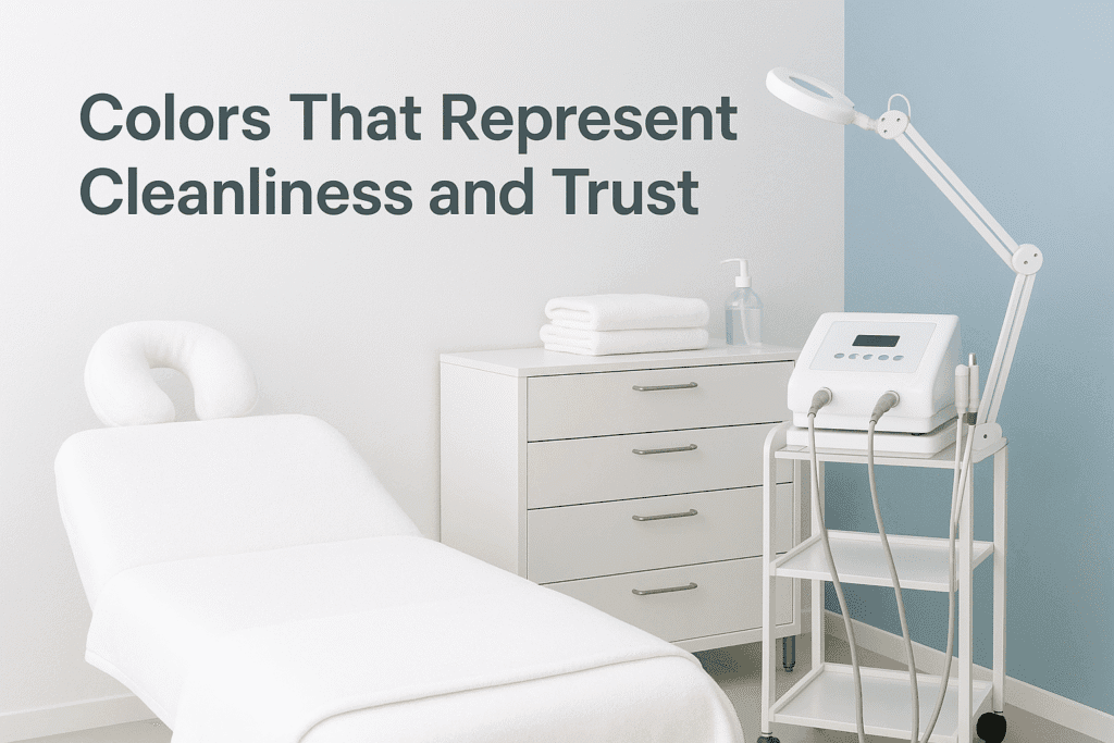
Colors That Represent Cleanliness and Trust
In the medical spa world, your clients expect a space that feels clean, sterile, and safe — just like a doctor’s office, but more relaxing. Certain colors help you communicate these qualities visually without saying a word. That’s where white and blue become powerful tools.
Why White Works
White is one of the most common colors used in medical environments for a reason: it immediately signals purity, cleanliness, and freshness. A white-themed spa gives off a sense of hygiene and safety, which is crucial in a setting where health treatments are being offered.
The Power of Blue
Blue is often associated with trust and stability. It’s the color most often used in hospitals and tech companies because it puts people at ease. In a med spa, blue walls or accents can help reinforce a sense of security and professionalism, while also creating a cool, calming effect.
“Color is a powerful communicator of mood and function — blue in particular tells clients they’re in capable hands.” — Karen Haller, Color Consultant
Tips for Using These Colors
Here are a few ways to incorporate white and blue in your spa:
White: Use it for your walls, towels, robes, and furniture to emphasize cleanliness.
Blue: Add it through lighting, décor accents, water features, or logo design.
Mixing tones: Pair soft blue tones with crisp whites for a soothing and modern aesthetic.
Key Takeaways
Key Points
Solutions
White symbolizes purity and cleanliness
Use white for surfaces and materials to reassure clients of hygiene
Blue communicates trust and calm
Include blue accents or lighting to build confidence
Color impacts perception of professionalism
Use a clean, consistent palette in your spa’s brand and space
Soft hues are more relaxing than bold ones
Choose pastel tones of white and blue for a serene vibe
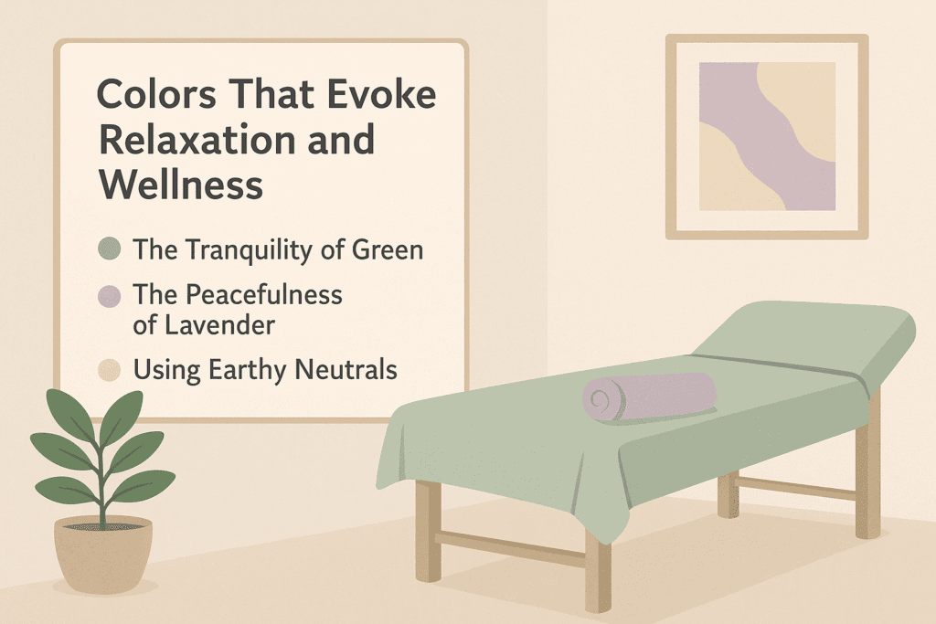
Colors That Evoke Relaxation and Wellness
In a medical spa, your goal is not only to treat but to soothe. Every inch of your space should help your clients unwind the moment they walk in. Colors like soft green, beige, and lavender play a huge role in setting that calming tone and encouraging a feeling of wellness.
The Tranquility of Green
Green is the color of nature, growth, and healing. In spa design, it represents balance and restoration, making it perfect for treatment rooms and relaxation areas. Whether through wall paint, plants, or upholstery, incorporating green gives clients a sense of calm and renewal.
The Peacefulness of Lavender
Lavender isn’t just a scent—it’s also a color that suggests gentle relaxation. Soft purples have been shown to reduce anxiety and are often used in wellness spaces to create an elegant, serene atmosphere.
Using Earthy Neutrals
Neutral tones like beige, taupe, and light browns help soften a space and pair well with greens and lavenders. These colors mimic the calming natural world and contribute to an overall feeling of groundedness.
“When clients feel emotionally safe and physically relaxed, they’re more likely to return and refer others.” — Dr. Jessica Nguyen, Spa Wellness Advisor
Design Tips for Relaxation
Use green accents in waiting rooms to reduce visual stress.
Add lavender tones in décor, branding, or staff uniforms to enhance calm.
Incorporate natural textures like wood or stone to amplify the wellness experience.
Key Takeaways
Key Points
Solutions
Green symbolizes healing and renewal
Use green in treatment areas to foster tranquility
Lavender reduces anxiety
Apply lavender in soft furnishings and branding
Earth tones enhance grounding
Blend neutrals with greens and purples for a spa-like ambiance
Natural colors promote relaxation
Design with textures and colors found in nature
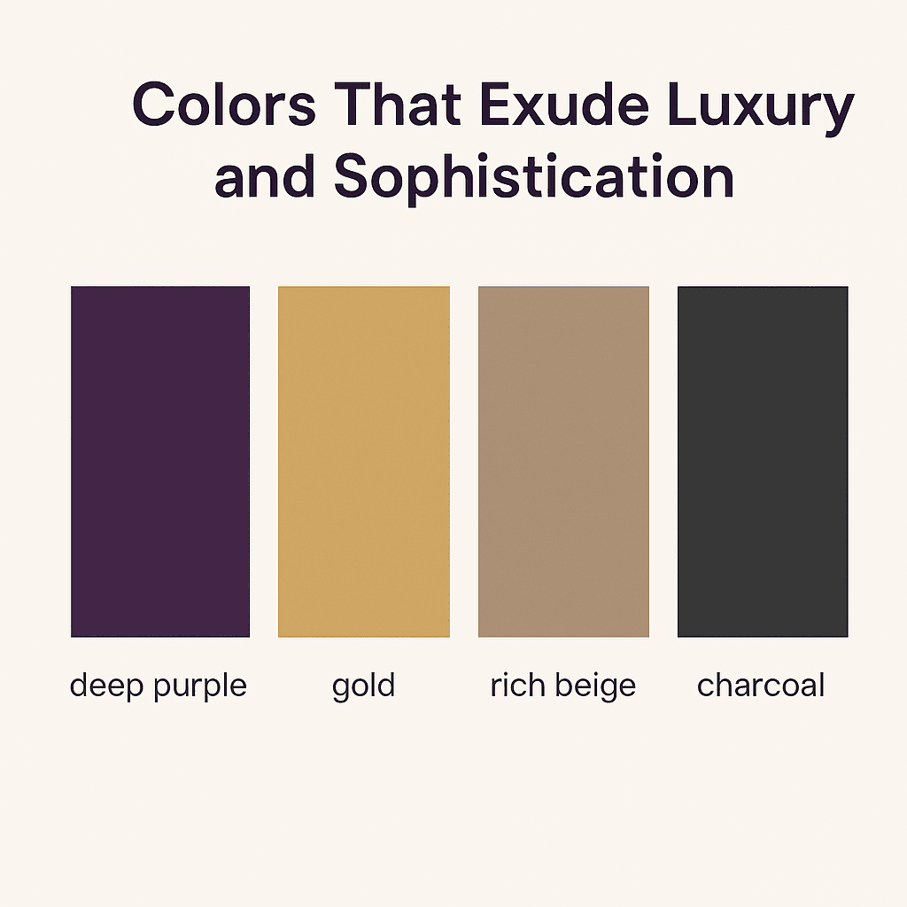
Colors That Exude Luxury and Sophistication
If your goal is to create a premium experience, color can help you make a powerful impression. Some shades instantly signal elegance, exclusivity, and high-end quality. In the med spa industry, deep purples, gold, and rich neutrals are the go-to colors for adding a touch of class and indulgence.
The Richness of Purple
Purple has long been associated with royalty and prestige. Deeper shades like plum or eggplant can elevate the look and feel of your spa, especially in private treatment rooms, branding elements, or accent walls. Lighter purples like lilac offer a more subtle sophistication.
Elegance Through Gold Accents
Gold doesn’t have to be flashy. Used sparingly — in mirrors, hardware, or logo detailing — gold can convey luxury and warmth. It pairs well with neutral backgrounds and adds a polished, upscale feel without overwhelming the space.
Neutral Tones with Depth
Colors like charcoal, warm beige, and dusty rose offer understated elegance. These hues provide a modern, timeless backdrop that enhances the perceived value of your treatments and environment.
“Luxury isn’t just about price — it’s about how your brand makes people feel. And color is central to that perception.” — Lindsley Ross, Brand Designer
Design Tips for High-End Branding
Add plum or rich purple in accent walls or branding.
Use gold in moderation to highlight key design features.
Choose rich neutrals as your base palette and build elegance through layering textures.
Key Takeaways
Key Points
Solutions
Purple conveys luxury and royalty
Incorporate rich purples in decor and branding to elevate ambiance
Gold suggests elegance and warmth
Use gold accents sparingly to create a polished, high-end feel
Neutral tones enhance upscale environments
Pair soft neutrals with bold accents to build a premium look
Color supports luxury branding
Design with deep, elegant tones that match your brand identity
Conclusion
Color isn’t just decoration in a medical spa — it’s a strategic tool. Whether you want to create a clean, trustworthy atmosphere, promote relaxation and healing, or project a sense of luxury and exclusivity, the right color palette can do the heavy lifting.
By understanding the psychology behind colors like white, blue, green, lavender, and gold, you’re able to make more intentional choices in how your med spa looks and feels. These colors speak directly to your clients’ needs for calm, cleanliness, and care. When used consistently across your interior design and branding, they become an extension of your spa’s identity and a subtle way to keep clients coming back.
Actionable List: How to Choose the Best Colors for Your Medical Spa
Define Your Brand Personality
Are you calming, clinical, luxurious, or holistic? Your color choices should reflect that.
Start With a Primary Emotion
Decide what you want clients to feel when they enter your spa: safe, relaxed, pampered?
Pick a Base Color from Psychology
Choose white or blue for cleanliness, green or lavender for relaxation, purple or gold for luxury.
Create a Simple Color Palette (3-5 colors)
Include base, accent, and neutral tones for balance and flexibility.
Test With Samples
Use swatches or mockups to see how colors feel in your actual space.
Be Consistent in Branding
Extend your palette to your logo, website, uniforms, and product packaging.
Frequently Asked Questions
1. What color makes a medical spa look clean?
White is the best color to communicate cleanliness and sterility. It also reflects light, making spaces appear brighter and more open.
2. Which colors help clients feel relaxed?
Soft greens, light lavenders, and earth tones help soothe anxiety and promote calmness.
3. Can I use bold colors in a med spa?
Yes, but sparingly. Use bold colors as accents rather than main tones to avoid overwhelming the senses.
4. How many colors should I use in my spa’s branding?
A good rule of thumb is 3-5: one primary color, one or two accent colors, and one or two neutrals.
5. What color represents luxury in a medical spa?
Deep purples, gold, and rich neutrals like charcoal and beige suggest elegance and high-end service.